Triple Bar Graph Maker
A triple bar graph shows three related values side by side for each category, using three grouped bars. This triple bar graph maker lets you enter your numbers, pick colors, and download a finished chart instantly. No account is needed, and your data never leaves your browser.
Enter Your Data
Comma-separated values, one series per bar.
How to Build This Graph Step by Step
- Enter your category labels, such as months or products, in the labels field.
- Type your three sets of numbers into the three value fields, or import them from a CSV file.
- Set a chart title and label your axes so the chart makes sense on its own.
- Choose colors for each of the three bars and pick where the legend appears.
- Download your chart as a PNG, JPG, or SVG file, or copy the embed code for your website.
The whole process usually takes less than a minute once your data is ready.
Example: Analyzing Product Sales, Returns, and Stock
A retail store wants to compare the number of units sold, units returned, and units remaining in stock for five products over one month. A triple bar graph makes it easier to compare these three values for each product.
| Product | Units Sold | Units Returned | Units in Stock |
|---|---|---|---|
| Laptops | 145 | 8 | 52 |
| Smartphones | 230 | 15 | 78 |
| Tablets | 175 | 11 | 64 |
| Headphones | 320 | 24 | 110 |
| Smartwatches | 195 | 13 | 71 |
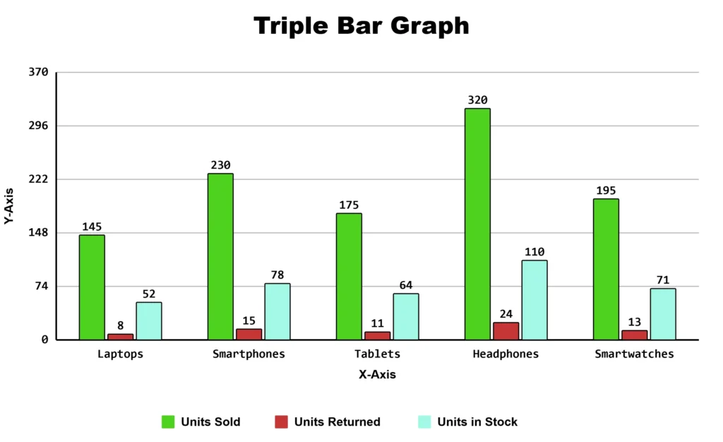
This graph helps the store quickly compare product performance and identify which products have high sales, more returns, or larger stock levels.
Features of This Triple Bar Graph Maker
- Import data directly from a CSV file
- Customize colors for each of the three bars individually
- Set chart title, axis labels, and legend position
- Download as PNG, JPG, or SVG
- Copy an embed code to place a live chart on your own site
- Works on phones and tablets; no software or design skills required
What Is a Triple Bar Graph?
It is also called a triple bar chart with three bars placed next to each other for every category on the horizontal axis. Each bar in the group stands for a different data set, so you can compare three numbers at once without switching between separate charts.
This chart type works well whenever you have exactly three things to compare across the same categories, such as three time periods, three branches, three survey answers, or three product lines.
Triple Bar Graph vs Stacked Bar Graph
| Chart Type | Best For | Bars Show a Total? |
|---|---|---|
| Triple bar graph | Comparing three independent values side by side for each category | No |
| Stacked bar chart | Showing three parts that add up to a whole in a single bar | Yes |
Choose the triple bar graph when you want to compare three values individually. Choose a stacked bar chart when those three values are parts of one total you want readers to see at a glance.
Which Bar Chart Fits Your Data?
The right chart depends on how many things you are comparing. Pick the tool that matches your exact number of data sets and keeps the chart clean and easy to read.
- Two data sets: Use a double bar graph maker.
- Three data sets: Use this tool.
- Four data sets: Use a quadruple bar graph maker.
- Five or more data sets: Use a multiple bar graph maker, or consider a stacked bar chart if you mainly care about totals rather than individual comparisons.
Common Uses for This Chart Type
Grouping three bars per category shows up often in real reporting work.
- Before, during, and after comparisons: A fitness coach might track a client’s weight, body fat percentage, and muscle mass at the start, midpoint, and end of a program.
- Three branch or store comparisons: A retail manager comparing foot traffic, sales, and returns across three store locations can spot which location needs attention.
- Three-year snapshots: A school comparing average test scores across three graduating years can see whether performance is improving or falling.
- Survey results with three answer choices: A restaurant asking customers to rate a dish as poor, average, or excellent can plot the three response counts side by side for each dish on the menu.
Avoiding a Crowded Chart
Three bars per category reads fine, but too many categories at once (fifteen-plus months, say) makes bars thin, and labels overlap. Fix it by grouping categories (months into quarters), switching to a horizontal layout, or splitting into two charts.
Frequently Asked Questions
About This Page
This guide was written and reviewed by Muhammad Umer Shuaib, who builds and maintains BarGraphMaker.co along with other educational web tools like a grade calculator. The examples and explanations on this page are created specifically for this guide. This page is reviewed and updated when important information or tool features change.