Quadruple Bar Graph Maker
A quadruple bar graph compares four related values for each category using four grouped bars. This quadruple bar graph maker lets you type in your numbers, adjust the colors and labels, and download a finished chart right away, with no sign-up required.
Enter Your Data
Comma-separated values, one series per bar.
Make a Quadruple Bar Graph
- Type your category names, such as quarters or regions, into the labels field.
- Enter your four sets of values in the four data fields, or import them from a CSV file.
- Add a chart title and label the x-axis and y-axis clearly.
- Set a distinct color for each of the four bars so they are easy to tell apart.
- Download the finished chart as a PNG, JPG, or SVG file, or grab the embed code for your website.
Example: Test Scores of Four Students
| Subject | Ali | Sara | Ahmed | Fatima |
|---|---|---|---|---|
| Physics | 85 | 92 | 78 | 88 |
| Chemistry | 90 | 86 | 82 | 94 |
| Math | 78 | 89 | 85 | 91 |
| Biology | 88 | 84 | 80 | 87 |
| Computer | 82 | 90 | 86 | 89 |
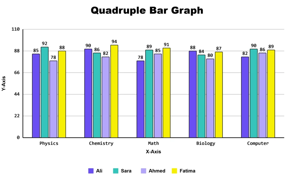
The resulting quadruple bar graph shows four bars for each subject, making it easy to compare the scores of all four students across five subjects.
Features of Quadruple Bar Graph Maker
- Import data directly from a CSV file.
- Set an individual color for each of the four bars.
- Customize chart title, axis labels, and legend position.
- Download as PNG, JPG, or SVG.
- Copy an embed code to place a live chart on your own website.
- Works on phones and tablets; no design skills required
What Is a Quadruple Bar Graph?
A quadruple bar graph uses four bars for each category. Each bar shows a different group or data set. This lets you compare four values side by side for the same category.
For example, a regional sales manager might track revenue from four sales regions, North, South, East, and West, across each quarter of the year. Instead of building four separate charts, one bar graph shows all four regions grouped under each quarter, making it easy to spot which region is leading or falling behind at any point in the year.
This chart works best when you have exactly four things to compare across shared categories, such as four regions, four products, four age groups, or four survey options.
Quadruple vs Stacked Bar Graph
| Chart Type | Best For | Bars Show a Total? |
| Quadruple bar graph | Comparing four independent values side by side for each category | No |
| Stacked bar chart | Showing four parts that add up to a whole in a single bar | Yes |
Common Uses for a Four Data Set Bar Graph
Grouping four bars per category appears often in business and research reporting.
- Quarterly year-over-year comparisons: A finance team comparing revenue across four quarters for two consecutive years can plot four bars per quarter to show growth or decline clearly.
- Four-way product comparisons: A product manager comparing customer ratings for four competing products across categories like price, quality, support, and design can spot strengths and weaknesses at a glance.
- Four region breakdowns: A logistics company tracking shipment volumes across four warehouses can quickly identify which warehouse is under or over capacity.
- Four age group survey results: A market research team collecting responses from four age brackets can compare preferences side by side for each survey question.
Four bars per category are easy to compare at a glance. Six or more can make the chart feel crowded. Keeping each group to four bars helps make the data clear and easy to read.
Choose a Suitable Tool
Matching the tool to your exact number of data sets keeps your chart readable.
- Single data set: Use the simple bar graph maker.
- Two data sets: Use the double bar graph maker.
- Three data sets: Use the triple bar graph maker.
- Four data sets: This bar chart creator is the right fit.
- Five or more data sets: use the multiple bar graph maker, or a stacked bar chart if totals matter more than individual values.
Why Four Bars Per Category Is Close to a Practical Limit
Four bars grouped is usually the largest number most readers can compare comfortably at a glance. Once you add a fifth or sixth bar, the group gets wide, colors become harder to tell apart, and the chart starts to feel busy. If your chart already has four bars and many categories, try these adjustments:
- Angle or rotate long category labels so they do not overlap.
- Limit the chart to the categories that matter most, such as the last eight quarters instead of every quarter since a company started.
- Split one crowded chart into two smaller, focused charts.
Your Data Never Leaves Your Browser
This quadruple bar graph maker creates your chart directly on your device using JavaScript. Nothing is uploaded to a server, and no account or login is required. Your data disappears the moment you close the tab, unless you choose to download the chart.
Frequently Asked Questions
About This Page
This guide was written and reviewed by Muhammad Umer Shuaib, who builds and maintains BarGraphMaker.co along with other educational web tools like a grade calculator. The examples and explanations on this page are created specifically for this guide. This page is reviewed and updated when important information or tool features change.