Percentage Bar Graph Maker
Want to compare how each category makes up a whole? Use our percentage bar graph maker to create a 100% bar graph that shows each category as a percentage of the total. Enter your data, and the tool automatically calculates the percentages and creates your chart. Customize the design and download your graph as a PNG, JPG, or SVG for free, with no signup required.
Enter Your Data
Comma-separated values, one series per bar.
Create a Percentage Bar Graph in 3 Steps
- Enter or import your data. Type your category labels and values directly into the tool, or upload a CSV file. You do not need to calculate percentages yourself. The tool automatically converts your raw numbers.
- Customize labels, colors, and style. Add a chart title, set axis labels, choose a color theme, and decide where the legend appears.
- Download or embed your chart. Save the finished graph as a PNG, JPG, or SVG file, or copy the embed code to place it directly on a website or blog post.
Key Features
- No sign-up or account required.
- Your data stays on your device and is never uploaded.
- Automatic percentage calculation from raw values.
- CSV import for larger data sets.
- Export as PNG, JPG, or SVG.
- One-click embed code for websites and blogs.
- Free to use with no limit on the number of charts.
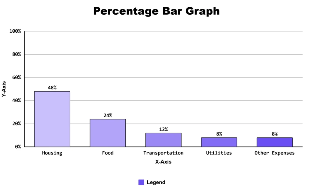
Example: Household Monthly Budget
A family wants to see how its monthly budget is divided among different expenses. Create a percentage bar graph to show what percentage of the total budget goes to each expense.
| Expense | Amount |
|---|---|
| Housing | $1,200 |
| Food | $600 |
| Transportation | $300 |
| Utilities | $200 |
| Other Expenses | $200 |
| Total | $2,500 |
What Is a Percentage Bar Graph?
A percentage bar graph, also called a 100% stacked bar chart, shows how a whole is divided into different parts. Each bar represents 100%, and each section shows the percentage of one category.
Unlike a regular bar graph, all bars have the same length. The sections inside each bar show how much each category contributes to the whole. This makes it easy to compare proportions rather than raw numbers.
Percentage Bars vs Regular Bars vs Pie Charts
A regular bar graph compares totals between categories. A percentage bar graph shows how each category makes up a whole. A pie chart also shows parts of a whole, but comparing bar lengths is generally easier than comparing angles and areas.
| Chart Type | Best For |
|---|---|
| Regular Bar Graph | Comparing totals between categories |
| Percentage Bar Graph | Comparing how each group is divided into percentages |
| Pie Chart | Showing parts of one whole |
Percentage bars are also useful when you want to compare the composition of several groups. Because all bars use the same 100% scale, you can compare their sections more easily than with several separate pie charts.
Tip: Add percentage labels to each section when exact values matter. This makes the chart easier to read without relying only on visual estimates.
When Should You Use This Chart Type?
Use a percentage bar graph when you want to see how a total is divided into parts rather than just comparing total amounts. Common uses include:
- Survey results: See how different groups answered a question.
- Budget breakdowns: Show how spending is divided between departments.
- Market share: Compare each product or region’s share.
- Department headcount: Compare how staff is divided across departments over time.
- Website traffic: Show the share of visits from search, social media, direct visits, and other sources.
This chart is especially useful when the totals are different between groups. For example, one region may have 200 sales while another has 2,000. Percentages let you compare how each region’s total is divided without the larger total dominating the chart.
Common Mistakes to Avoid
Most guides skip these details, but they affect whether your chart reads correctly.
- Rounded percentages may not add up to exactly 100. If your values are 33.3, 33.3, and 33.3 percent, they round to 33 percent each and sum to 99, not 100. This is normal. Most tools, including this one, adjust the display slightly so bars still appear to reach full length.
- Too many categories make a bar hard to read. Once a bar is split into more than five or six sections, colors become difficult to tell apart. Group smaller categories into a single “Other” section instead of showing a dozen thin slices.
- Inconsistent category order breaks comparison. If bread appears first in one bar and last in another, readers cannot track how one category changes across groups. Keep the same category in the same position in every bar.
- Color choice affects accessibility. Around 1 in 12 men have some form of color vision deficiency. Avoid relying only on red and green to separate segments. Add data labels or use a palette with enough contrast in brightness, not just hue.
Frequently Asked Questions
About This Page
This guide was written and reviewed by Muhammad Umer Shuaib, who builds and maintains BarGraphMaker.co along with other educational web tools like a grade calculator. The examples and explanations on this page are created specifically for this guide. This page is reviewed and updated when important information or tool features change.