Bar Graph Maker with Error Bars
A single bar only tells half the story. Real data almost always carries some margin of error, and this bar graph maker with error bars lets you show it clearly. Enter your values, set an upper and lower error for each one (symmetric or asymmetric, both work), and get a clean, publication-ready chart in seconds. No sign-up, no limits. Just enter your data and download the graph as PNG, JPG, or SVG right away.
Enter Your Data
Comma-separated values, one series per bar.
Building Your Chart in 4 Steps
- Enter your category labels and average values into the data table, or import a CSV file.
- Add the upper and lower values for each bar, based on standard deviation, standard error, or a confidence interval.
- Set the chart title, axis labels, colors, and legend position.
- Download your finished result as a PNG, JPG, or SVG, or copy the embed code to add it to your website or blog post.
Example: Comparing Blood Pressure Reduction After Treatment
A health study compares how three common treatments affect blood pressure. Researchers measure several people using each treatment and calculate the average reduction in blood pressure. Since people respond differently, the results also have some variation.
|
Treatment |
Average Reduction (mmHg) |
Error (± mmHg) |
|---|---|---|
|
Lifestyle Changes |
8 |
3 |
|
Daily Exercise |
12 |
2 |
|
Low-Sodium Diet |
10 |
4 |
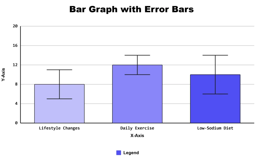
The bars show the average reduction in blood pressure, while the error bars show how much the results varied among participants. This makes it easier to see not only the average effect of each treatment but also how consistent the results were.
Why error bars matter: Two treatments can have similar average results but very different levels of variation. Error bars make that difference visible.
Features of This Bar Graph Maker With Error Bars
- Import data and range values directly from a CSV file
- Choose standard deviation, standard error, or a confidence interval per chart
- Customize colors, title, axis labels, and legend position
- Download as PNG, JPG, or SVG
- Copy an embed code to place a live chart on your own site
- Works on phones and tablets; no software or design skills required
Standard Deviation, Standard Error, or Confidence Interval
These three terms get mixed up often, but they answer different questions.
|
Statistic |
What It Shows |
When to Use It |
|---|---|---|
|
Standard Deviation |
How spread out the raw data points are |
Showing natural variation between individual results |
|
Standard Error |
How precise your estimate of the average is |
Showing confidence in a calculated mean |
|
95% Confidence Interval |
The range likely to contain the true average |
Comparing groups or reporting research results |
Standard deviation describes spread among individual observations, while the other two options describe how reliable an estimated mean is. Choosing the wrong one will not change your numbers, but it can change what your chart appears to prove.
What Do These Markers Show on a Chart?
This tool is part of our full bar graph maker suite, which also includes double, stacked, and segmented bar graph options for different data needs.
A small line on top of a bar tells you how spread out or uncertain the data behind it really is. A short line means the values are close together. A long one means they are spread out, or the estimate is less certain. This turns a single number into an honest picture of what the data actually looked like.
These markers most often represent one standard deviation, one standard error, or a 95 percent confidence interval, and the type used should always be stated next to the chart.
When Should You Add Them to Your Data?
Use this feature any time a bar represents an average or an estimate rather than a single fixed count. Common cases include:
- A school science fair project comparing plant growth under different light levels
- A college lab report comparing reaction times across test groups
- A teacher averaging test scores across several classes at a local high school
- A small business comparing average order value across store locations
- A survey comparing average ratings between two customer groups
If your bar shows a mean, a percentage estimate, or a measurement taken more than once, this range tells the reader how much to trust that bar.
Common Mistakes to Avoid
- Not stating whether the range shown is standard deviation, standard error, or a confidence interval
- Assuming overlapping ranges always mean there is no real difference between groups
- Leaving out the sample size, which makes the range impossible to judge
- Using inconsistent scales between charts that will be compared side by side
- Adding this detail to a bar that represents a single count instead of an average
Frequently Asked Questions
About This Page
This guide was written and reviewed by Muhammad Umer Shuaib, who builds and maintains BarGraphMaker.co along with other educational web tools like a grade calculator. The examples and explanations on this page are created specifically for this guide. This page is reviewed and updated when important information or tool features change.