Stacked Bar Graph Maker
A stacked bar graph maker that turns your data into a bar chart with colored sections in seconds. Free, browser-based, and built for sales reports, budgets, and business comparisons where you need to see the total and its breakdown at once. Enter your numbers, customize the look, and download as PNG, JPG, or SVG, with no account and no data leaving your device.
Enter Your Data
Comma-separated values, one series per bar.
How to Make This Chart
- Enter your data: Type category labels and values, or import a CSV with one column per group.
- Choose your bar count: Pick how many bars you need and how many sections each bar holds, up to five.
- Customize the look: Set your title, axis labels, section colors, and legend position.
- Download or embed: Save as PNG, JPG, or SVG, or copy the embed code for your own site.
Your data stays in your browser the entire time. Nothing is uploaded, so a confidential company report stays private from start to finish.
What Is a Stacked Bar Graph?
A stacked bar graph, also called a stacked bar chart, works best when each bar has a meaningful total that can be divided into a few clear parts. If there’s no meaningful total and you only need to compare individual values, a standard bar graph may be a better choice.
A stacked bar graph shows how several smaller parts add up to one total inside a single bar. Each bar represents one category, split into colored sections that stand for smaller groups within it. The full height of the bar shows the total value, while each section shows how much that group added to the total.
Business owners use it to compare monthly sales across product lines. Analysts use it to break down budgets by department. Sales teams use it to show quota performance split by rep or region, all while keeping the overall total visible at a glance.
Features of Stacked Bar Graph Maker
- Import data directly from a CSV file
- Customize section colors, background style, and legend position
- Adjust font sizes for titles and axis labels
- Download as PNG, JPG, or SVG
- Copy an embed code to place a live chart on your own site
- Works on phones and tablets, no software or design skills required
Stacked Bar Chart Example
Say a retail store tracks sales across three product categories over four quarters:
| Quarter | Apparel | Footwear | Accessories | Total |
|---|---|---|---|---|
| Q1 | $18,000 | $12,000 | $5,000 | $35,000 |
| Q2 | $21,000 | $14,500 | $6,200 | $41,700 |
| Q3 | $19,500 | $16,000 | $7,100 | $42,600 |
| Q4 | $27,000 | $19,000 | $9,500 | $55,500 |
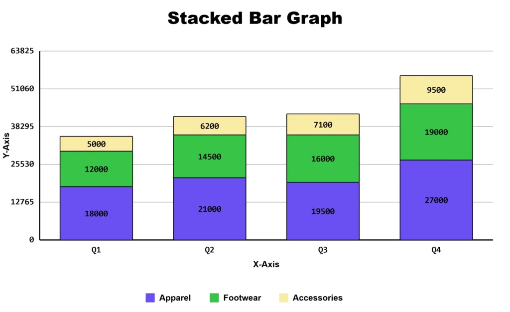
One bar per quarter, split into three colored sections. A manager glances at this and immediately sees two things: total revenue grew every quarter, and apparel consistently drives the largest share. That’s the specific advantage of a stacked bar graph over a plain bar chart: you get the total and the breakdown in one image, without needing two separate charts.
Stacked vs Segmented vs Grouped
| Chart Type | What It Shows | Best For |
|---|---|---|
| Stacked bar graph | Total value per bar, split into sections | Comparing totals while showing what each is made of |
| Segmented bar graph | Same concept as stacked. The terms are used interchangeably, though “segmented” is more common in classroom and statistics contexts | Survey data, education, and stats coursework. |
| Grouped bar graph (double/triple) | Bars placed side by side, not stacked | Comparing exact values across groups directly |
Working with classroom or survey data specifically? Our segmented bar graph maker is built around that use case. If a grouped chart fits your data better, the double bar graph maker and triple bar graph maker build those directly.
When to Use This Chart
This chart works best when you have two to five smaller groups that add up to one clear total. It has real limits, though:
- More than five sections, the smaller ones get hard to read and label. Group minor categories into “Other” if you’re over that.
- Comparing a middle section across two bars is genuinely hard to read, since only the bottom section of each bar starts from the same baseline. If the story you’re telling depends on comparing “Footwear” exactly across Q1 and Q3, a grouped bar chart will make that comparison far easier to see.
- Negative values break the stacking logic. Bars won’t stack the way you’d expect, and the chart becomes misleading rather than clarifying.
Stacked Bar Graphs for Students
While this stacked bar graph creator is built for business and sales reporting, it also shows up in classrooms. Many U.S. elementary and middle school math classes teach students to read and build bar graphs under the Common Core State Standards for Measurement and Data.
Grade 2 standards ask students to draw and interpret bar graphs with up to four categories. By Grade 3, students work with scaled bar graphs and solve comparison problems using them, according to the Common Core State Standards Initiative.
Frequently Asked Questions
About This Page
This guide was written and reviewed by Muhammad Umer Shuaib, who builds and maintains bargraphmaker.co along with other educational web tools like a grade calculator. The examples and explanations on this page are created specifically for this guide. This page is reviewed and updated when important information or tool features change.