Horizontal Bar Graph Maker
Need to compare categories quickly, especially when the names are long? Use our horizontal bar graph maker to create a clear horizontal chart in seconds. Add your data, customize the bars, labels, and colors, then download your graph for school, work, or presentations. It is free, easy to use, and requires no sign-up.
Enter Your Data
Comma-separated values, one series per bar.
How To Use This Tool
- Enter your data. Type your category labels and values, or import them from a CSV file.
- Set the style. Choose your title, axis labels, colors, and legend position.
- Download or embed. Save your graph as an image, or copy the embed code for your website or blog.
- Everything runs in your browser. Your numbers never leave your device or get uploaded to a server.
Key Features of Horizontal Bar Graph Maker
- Import data directly from a CSV file.
- Customize title, axis labels, colors, and legend position.
- Show or hide data labels on bars.
- Download as PNG, JPG, or SVG.
- Copy an embed code to place a live chart on your own site.
- Works on every device, no software or design skills required.
What Is a Horizontal Bar Graph?
It is also called a horizontal bar chart. It shows data using bars that stretch from left to right. Each bar represents one category, listed along the left side of the chart. The length of the bar shows its value, and longer bars mean bigger numbers.
This layout is used often in statistics classrooms, business reports, and news graphics because it keeps every label readable, even long ones like country names or full survey answers.
Example: After-School Activities
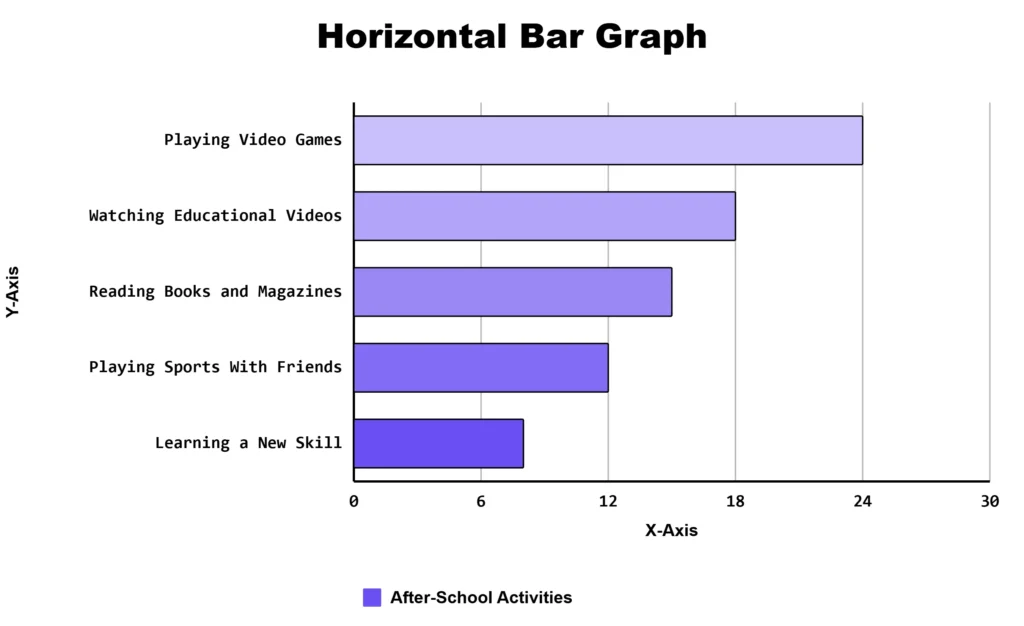
A school surveys students about the activities they enjoy after school. Create a horizontal bar graph to compare the number of students who chose each activity.
| Activity | Students |
|---|---|
| Playing Video Games | 24 |
| Watching Educational Videos | 18 |
| Reading Books and Magazines | 15 |
| Playing Sports With Friends | 12 |
| Learning a New Skill | 8 |
When This Layout Beats a Vertical Bar Graph
A vertical bar graph, also called a column chart, works well for short labels and a small number of categories, like the months of a year. This layout works better when:
- Your labels are long, such as “Strongly agree” or “United Kingdom”
- You are comparing 8 or more items at once
- You want to rank items from highest to lowest
Students in a high school statistics class often reach for a horizontal layout when charting survey answers, since long response text fits cleanly on each line without shrinking or tilting.
Horizontal Bar Graph vs Vertical Bar Graph vs Gantt Chart
|
Chart Type |
Best For |
Common Mistake |
|---|---|---|
|
Horizontal Bar |
Long labels, rankings, 8+ categories |
Leaving bars unsorted, which makes comparison harder |
|
Vertical Bar |
Short labels, fewer categories, month-by-month data |
Cramming in too many bars, forcing tiny text |
|
Gantt Chart |
Project timelines and task duration |
Confusing it with a value-based bar chart, since both use bars running left to right |
A Gantt chart looks similar in appearance, but it tracks time, not value. Each bar marks a start date and an end date.
Real Situations Where This Chart Type Shines
- Classroom Assignments: A middle school science project comparing rainfall across five cities reads more clearly this way than as a crowded column chart.
- Survey and Poll Results: Long answer choices, like customer satisfaction ratings, fit neatly on horizontal bars without wrapping to a second line.
- Country or Region Comparisons: Full country names never need to be shortened or angled.
- Small Business Reports: A local coffee shop owner comparing weekly sales across ten menu items can rank them from best seller to slowest mover at a glance.
- College Research Projects: A community college statistics assignment comparing enrollment across departments benefits from the same ranked, easy-to-scan format.
- Progress Tracking: Comparing how close five teams are to a fundraising goal is easy to read when bars run left to right.
Tips for a Cleaner Chart
Sort your bars from largest to smallest. According to data visualization, removing unnecessary clutter and ordering data logically helps readers understand a chart faster and with less effort. A few more practical tips:
- Keep your chart to 10 or 15 bars. Past that point, readers have to scroll and lose the big picture.
- Use one color when all bars belong to the same group, like monthly numbers. Use a different color per bar when categories are unrelated, like separate countries or products.
- Turn on data labels if you plan to export the chart as a static image. Without hover tooltips, printed numbers remove any guesswork.
- Export as SVG for websites, since it stays sharp at any size. Use PNG for slides and reports.
Frequently Asked Questions
About This Page
This guide was written and reviewed by Muhammad Umer Shuaib, who builds and maintains BarGraphMaker.co along with other educational web tools like a grade calculator. The examples and explanations on this page are created specifically for this guide. This page is reviewed and updated when important information or tool features change.