
Segmented Bar Graph Maker
A segmented bar graph maker for students, teachers, and researchers. Turn survey results, enrollment figures, or stats coursework into a clear chart with colored sections showing how each total breaks down. Enter your data, customize colors and labels, and download as PNG, JPG, or SVG, right in your browser with nothing uploaded or saved.
Enter Your Data
Comma-separated values, one series per bar.
How to Create a Segmented Bar Graph
- Enter your data by typing it into the tool or importing a CSV file from Excel or Google Sheets.
- Label your categories and identify the segments that make up each total.
- Customize your graph by choosing colors, font size, title, labels, axes, and legend position. Use strong contrast so the chart remains easy to read.
- Download or embed your graph as PNG, JPG, or SVG, or copy the embed code for your website or blog.
What Is a Segmented Bar Graph?
A segmented bar graph, also called a segmented bar chart, divides each bar into colored sections that add up to a meaningful total. If there’s no meaningful total, a standard bar graph is a better choice.
Students first meet this chart under Common Core Measurement and Data standards, then again in AP Statistics or intro college stats.
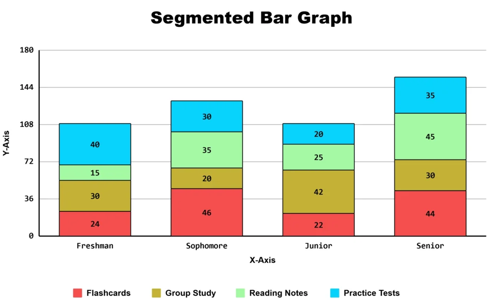
Segmented Bar Chart Example – Survey Data
Suppose a college statistics class surveys 80 students in each of four class years about their preferred study method.
| Class Year | Flashcards | Group Study | Reading Notes | Practice Tests | Total |
|---|---|---|---|---|---|
| Freshman | 30 | 25 | 20 | 5 | 80 |
| Sophomore | 22 | 24 | 18 | 16 | 80 |
| Junior | 15 | 20 | 15 | 30 | 80 |
| Senior | 10 | 15 | 12 | 43 | 80 |
Features of Segmented Bar Graph Maker
- Import data directly from a CSV file
- Customize section colors, background style, and legend position
- Adjust font sizes for titles and axis labels
- Download as PNG, JPG, or SVG
- Copy an embed code to place a live chart on your class site or report
- Share your chart directly with a link, no download needed
- Works on phones and tablets, no software or design skills required
Segmented Bar Graph vs. Stacked Bar Chart vs. 100% Stacked Bar Graph
These three chart types can look similar but serve different purposes. The terms segmented bar graph and stacked bar chart are used interchangeably in many educational and software contexts; “segmented” is more common in classrooms and statistics textbooks, while “stacked” is more common in business dashboards and software.
| Chart Type | What It Shows | Best For |
| Segmented bar graph | Parts and the total value in one bar | Comparing size and makeup together. Common in stats coursework. |
| Stacked bar chart | Multiple values stacked within each bar | Comparing totals and their components across groups. Common in business reporting. |
| 100% Stacked Bar Graph | Each bar represents the same 100% total | Comparing proportions between groups |
Building a business or sales report instead of a classroom assignment? Our stacked bar graph maker uses the same underlying chart, with examples built around sales and budget data. If your data only needs proportions rather than totals, try the percentage bar graph maker.
Who Can Use This Tool
- Students: Science projects, surveys, classroom assignments, and AP Statistics coursework
- Teachers: Grade reports, survey results, classroom data, and teaching materials
- Researchers: Survey answers grouped by age, major, location, or other categories
- Administrators: Budgets, enrollment figures, and other organizational data
- Content creators: Turning population, budget, or survey data into clear visuals without design software
Common Mistakes to Avoid
- Too many segments. A graph with too many categories can become difficult to read. Group smaller categories into “Other” when appropriate.
- Low-contrast colors. Make sure neighboring segments are easy to distinguish. Avoid relying on red and green alone to communicate differences.
- Skipping the legend. Use a clear legend when readers need help identifying each segment. Direct labels can work well when there is enough space.
- Changing segment order. Keep the same segment order and color for comparable bars so readers can follow the categories easily.
Making Your Chart Accessible
An accessible chart should not rely on color alone to communicate important information. Use clear labels, readable text, and a visible legend so users can understand each segment without depending only on color.
Choose colors with enough contrast and avoid combinations that are difficult to distinguish for people with color vision deficiencies. Add labels or other visual cues when needed to make each segment clear. This matters especially for classroom materials that will be printed in grayscale or projected on older equipment.
Frequently Asked Questions
About This Page
This guide was written and reviewed by Muhammad Umer Shuaib, who builds and maintains BarGraphMaker.co along with other educational web tools like a grade calculator. The examples and explanations on this page are created specifically for this guide. This page is reviewed and updated when important information or tool features change.