Multiple Bar Graph Maker
A multiple bar graph compares five or more related values for each category, using a group of bars for every category on the chart. This multiple bar graph maker is built for larger comparisons that go beyond three or four data sets, letting you enter your numbers and download a finished chart in minutes.
Enter Your Data
Comma-separated values, one series per bar.
How to Build This Chart Step by Step
- Enter your category names, such as schools or products, into the labels field.
- Add your data sets one at a time using the value fields, or import all of them at once from a CSV file.
- Give your chart a title and clear axis labels.
- Choose a distinct color for each data set, so the groups stay easy to tell apart.
- Download your chart as a PNG, JPG, or SVG file, or copy the embed code to use on your website.
Example: Comparing Monthly Sales of Products
A shop wants to compare the average sales of four products over five months. A multiple bar graph makes it possible to see all four products’ sales side by side for each month.
|
Product |
Jan |
Feb |
Mar |
Apr |
May |
|---|---|---|---|---|---|
|
Laptops |
42 |
48 |
55 |
61 |
68 |
|
Phones |
65 |
72 |
80 |
88 |
96 |
|
Tablets |
35 |
41 |
46 |
52 |
58 |
|
Headphones |
78 |
85 |
94 |
102 |
115 |
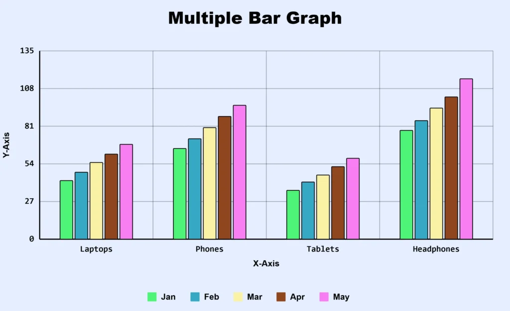
Why this is a good example: Five data sets are being compared for every category, so using a multiple bar chart is more appropriate than forcing the data into a double, triple, or quadruple bar graph.
What Is a Multiple Bar Graph?
It is also called a multiple bar chart. It groups five or more bars under each category so several data sets can be compared side by side. If you only have two, three, or four data sets, the double, triple, or quadruple bar graph maker will give you a cleaner result.
For example, a school district might track average test scores across five academic years for the same set of schools. This chart type places five bars under each school, one for each year, so a reader can see the trend for every school at once instead of reading five separate tables.
Key Features of Multiple Bar Graph Maker
- Import data via CSV file.
- Set an individual color for every group.
- Customize chart title, axis labels, and legend position.
- Download as PNG, JPG, or SVG.
- Copy an embed code to place a live chart on your own site.
- Works on every device; no software or design skills required.
Best Uses for Comparing Many Data Sets at Once
Multi-year trend tracking: A city government tracking annual water usage across seven consecutive years for several districts can show long-term patterns clearly.
Multi-branch dashboards: A retail chain comparing monthly sales across six or more store locations can use one chart to monitor overall performance.
Survey results across many groups: A research team collecting responses from six or more demographic groups can compare answers to the same question side by side.
Multi-product performance reviews: A company reviewing five or more product lines across a shared set of metrics, such as revenue, returns, and customer ratings, can use this format to spot which products need attention.
Multiple, Quadruple, or Stacked
As the number of data sets grows, the right chart type changes. With five or six data sets, this grouped format can still work if categories are kept to a reasonable number. Beyond six or seven data sets, a stacked bar chart often communicates the story better.
When Grouped Bar Graphs Become Hard to Read
Once a chart groups more than five bars under each category, a few problems tend to appear. Colors become difficult to distinguish, especially for readers with color blindness. Bars get thinner, making small differences hard to see. The legend grows long, forcing the reader to look back and forth between the chart and the key repeatedly.
A few adjustments help:
- Limit the number of categories shown per chart, even if that means creating two charts instead of one.
- Use a horizontal bar layout, which gives more room for both labels and bars.
- Choose colors with strong contrast between each other, rather than similar shades.
- If a chart feels cluttered, splitting the data into smaller, focused charts is usually the better path.
No Sign Up, No Uploads
This grouped bar graph maker builds your chart directly in your browser. Nothing is sent to a server, stored, or shared with anyone. There is no account to create. You can close the tab whenever you like, and nothing is kept unless you download the chart yourself.
Frequently Asked Questions
About This Page
This guide was written and reviewed by Muhammad Umer Shuaib, who builds and maintains BarGraphMaker.co along with other educational web tools like a grade calculator. The examples and explanations on this page are created specifically for this guide. This page is reviewed and updated when important information or tool features change.