
Double Bar Graph Maker
Use this free double bar graph maker to create a double bar graph online instantly. No sign-up, no design skills needed. Enter your numbers, pick your colors, and download a clean, presentation-ready chart in just a few clicks.
Enter Your Data
Comma-separated values, one series per bar.
Create Your Chart in Simple Steps
- Enter your first set of numbers, one value per category.
- Add your second set of numbers using the same category labels.
- Set your chart title, axis labels, and bar colors.
- Download as PNG, JPG, or SVG, or copy the embed code for your website.
Features of Double Bar Graph Maker
- Import data directly from a CSV file.
- Customize bar colors and background styles.
- Adjust font sizes for titles and axis labels.
- Download as PNG, JPG, or SVG.
- Copy an embed code to place a live chart on your own site, with an optional credit link.
- Works on phones and tablets.
What Is a Double Bar Graph?
A double bar graph, also called a double bar chart, places two related sets of numbers side by side across the same categories, so you can compare them at a glance. Each category gets two bars instead of one, usually in different colors, making it easy to spot which group is higher, lower, or roughly equal at every point.
It’s the go-to chart for comparisons like sales this year against last year, or two classes’ test scores, where the two values don’t need to add up to anything.
Double Bar Graph Example
Ahmed read 3 books in June, 5 in July, 4 in August, and 6 in September. His sister Zara read 4, 3, 6, and 5 books in the same four months.
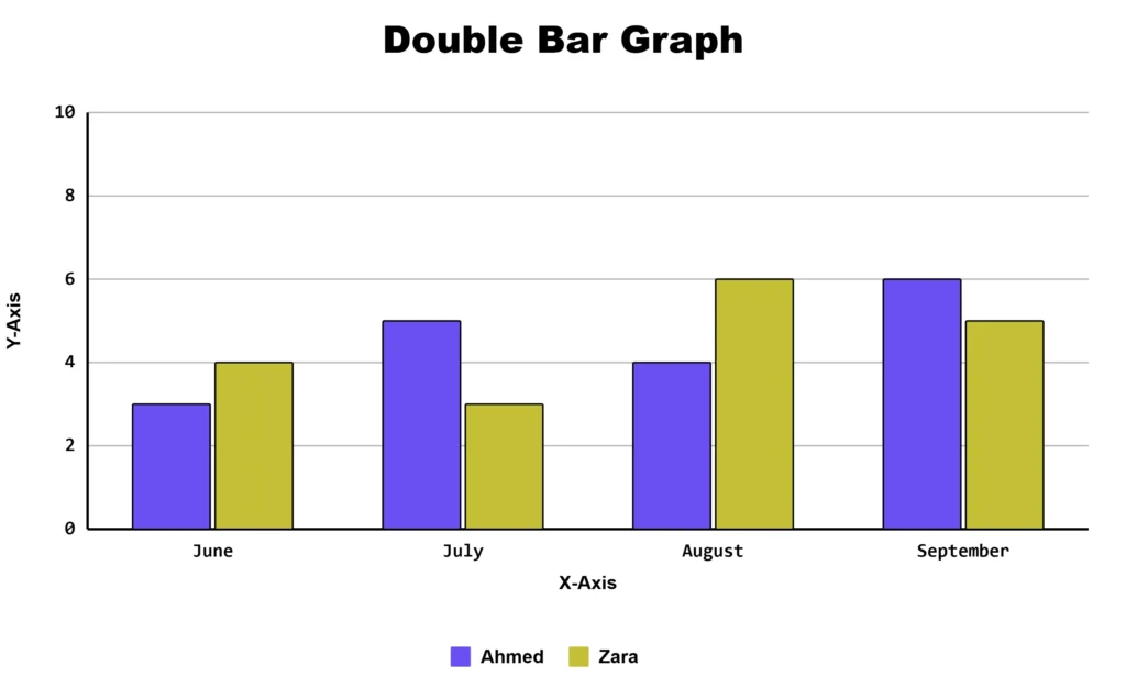
The chart makes it easy to see that Zara read more in June and August, Ahmed read more in July and September, and their totals for the summer end up almost even.
How to Read a Double Bar Graph
Each category on the x-axis gets two bars instead of one, usually shown in different colors, with a legend explaining which color is which group. To compare the two groups within a category, look at bar height side by side. To compare one group across categories, scan across all the bars of that color.
There’s no addition involved: unlike a stacked bar chart, the two bars in a double bar graph don’t need to sum to anything meaningful.
When to Use This Chart
Use a double bar graph when you have exactly two groups of numbers sharing the same categories: rainfall in two cities, scores from two classes, or monthly sales at two stores.
More than two groups? Try the multiple bar graph maker or triple bar graph maker. Comparing parts of one whole (like budget sections)? Use the stacked bar graph maker or segmented bar graph maker instead.
Building a scaled bar graph with several categories is part of the U.S. Common Core Math standard 3.MD.B.3 for third grade, so this tool doubles as a ready-made classroom resource.
Double Bar vs Stacked Bar Graph
|
Chart Type |
Best For |
Bars Show a Total? |
|---|---|---|
|
Double bar graph |
Comparing two independent groups side by side (e.g., two cities, two years) |
No |
|
Stacked bar chart |
Showing parts that add up to a whole in a single bar |
Yes |
Choose the double bar graph when you want a clean side-by-side comparison, and your numbers don’t need to sum to anything. Choose a stacked bar chart when your two values are parts of one total, like budget categories that should add up to 100%.
Frequently Asked Questions
About This Page
This guide was written and reviewed by Muhammad Umer Shuaib, who builds and maintains BarGraphMaker.co along with other educational web tools like a grading calculator. The examples and explanations on this page are created specifically for this guide. This page is reviewed and updated when important information or tool features change.